TAKE IT FROM THE TOP •

2023

BRAND ROLLOUT

PROJECT DURATION

Brand Identity,

Guidelines,

Templates,

Client Presentation

KEY SKILLS

The Blakeney Group,

Brand Strategist,

Digital Director

Delivery of an inclusive logo design and brand system for a regenerative farming non-profit in time for COP28.

2023

BRAND ROLLOUT

MY CONTRIBUTION

Logo Design, Guidelines,

Templates,

Client Presentation

THE TEAM

The Blakeney Group,

Brand Strategist,

Digital Director

Delivery of an inclusive logo design and brand system for a regenerative farming non-profit in time for COP28.

Delivery of an inclusive logo design and brand system for a regenerative farming non-profit in time for COP28.

Overview

Regen10 is an organisation built up of many multistakeholder partnerships, with the shared aim of working with farmers to achieve regenerative food systems. With a long road ahead, and many stakeholders to represent, a strong and inclusive brand was crucial for their launch at COP28.

Presenting Three Routes

Given the stringent deadline and requirement to please the many stakeholders, we decided the best strategy would be to present three routes. The three routes were presented using the same colour scheme and typography, so the client could focus on the concept,

Presenting Three Routes

Given the stringent deadline and requirement to please the many stakeholders, we decided the best strategy would be to present three routes. The three routes were presented using the same colour scheme and typography, so the client could focus on the concept,

Route One: Circularity

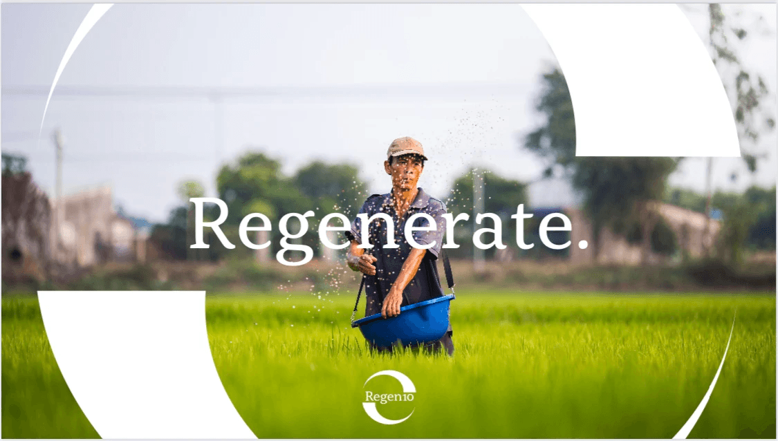
Circularity is a fundamental visual element for regeneration, as it represents a continuous cycle of growth and renewal.


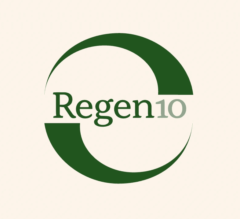
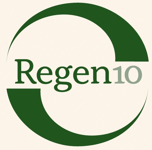
The logo consists of two balanced and rotating halves of a circle, which aims to create a sense of wholeness. However, the circle remains incomplete as Regen10 continues to search for a solution to achieve their goals.


The two halves of the circle also depict the earth above and below, emphasising the importance of a holistic and interconnected approach to regenerative practices.
Route Two: Land

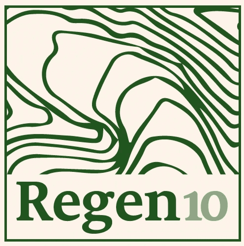
Landscapes hold different meanings for different people. Regen10 recognise that regenerative food systems must be developed at the landscape level, involving farmers and other food system actors.


This system uses topography as a visual diver, amplifying existing methods in the pursuit of knowledge.


The logo displays highlighted pieces of land, which could be a variable logo, never showing the same piece of land twice. Showcasing land from all over the world within the logo symbolises Regen10's efforts to connect landscapes and learn from their experiences.

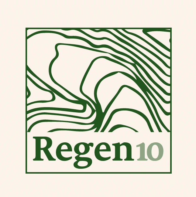
Route Three: Mosaic

A mosaic of knowledge from different groups of people is a crucial factor in achieving Regen10's mission.


To represent Regen10's meticulous approach, I reduced the weight of the letterforms in the logo, which create more delicate and organic structures.


The "R" is boxed within a square, or piece of land, creating river-like shapes. This design represents Regen10's attempt to connect the dots with other initivies and people, allowing information

to flow together from multiple sources and representing Regen10's meta initiative.

Outcome

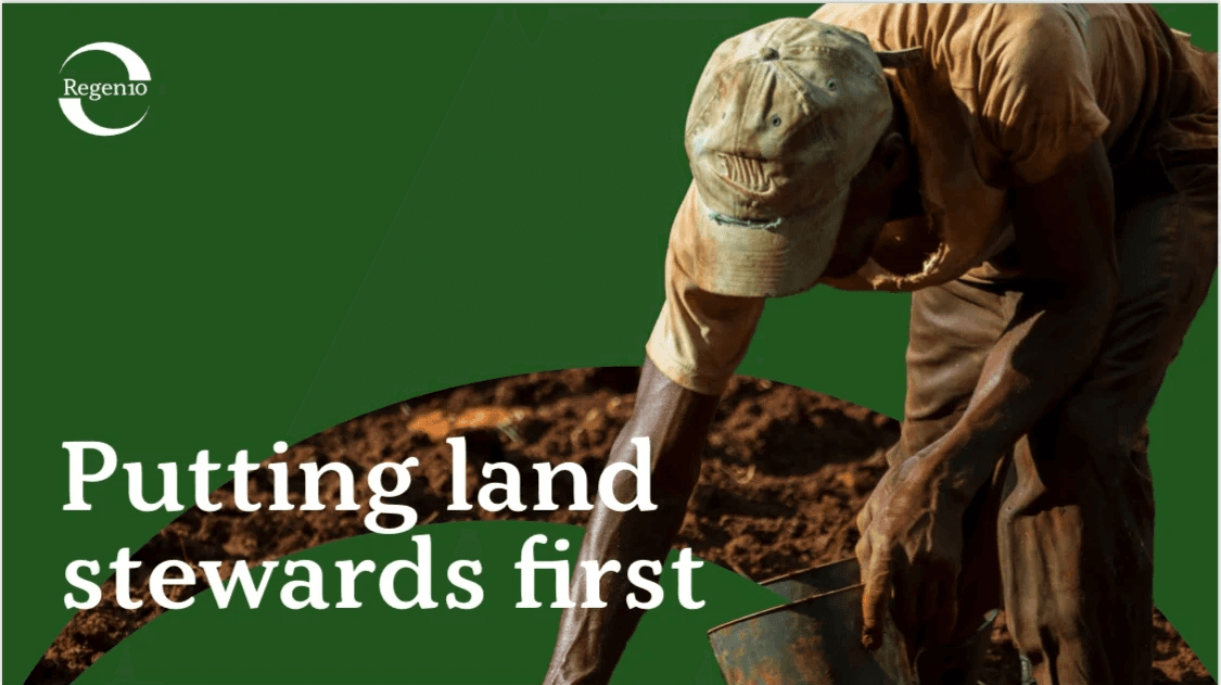
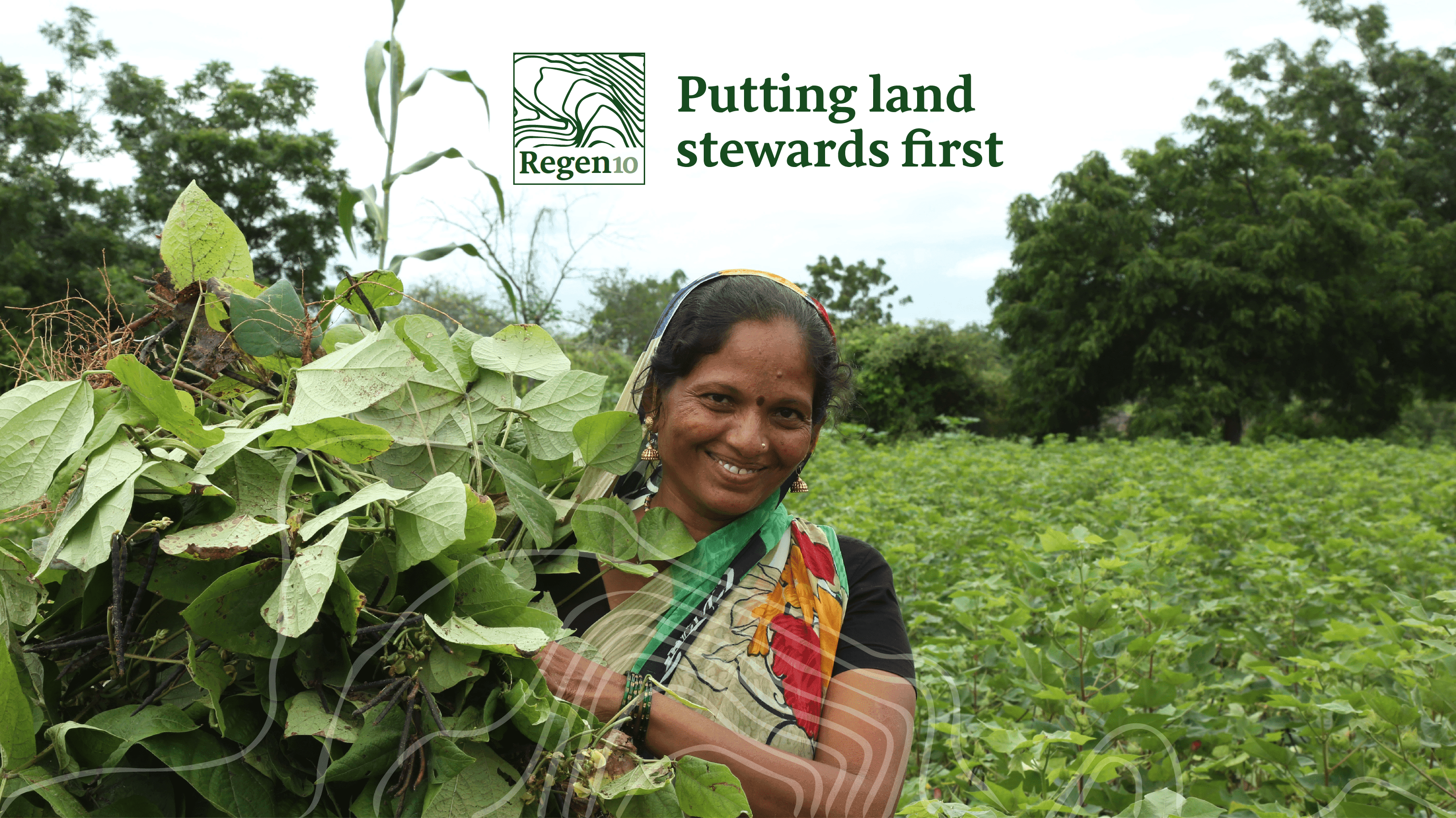
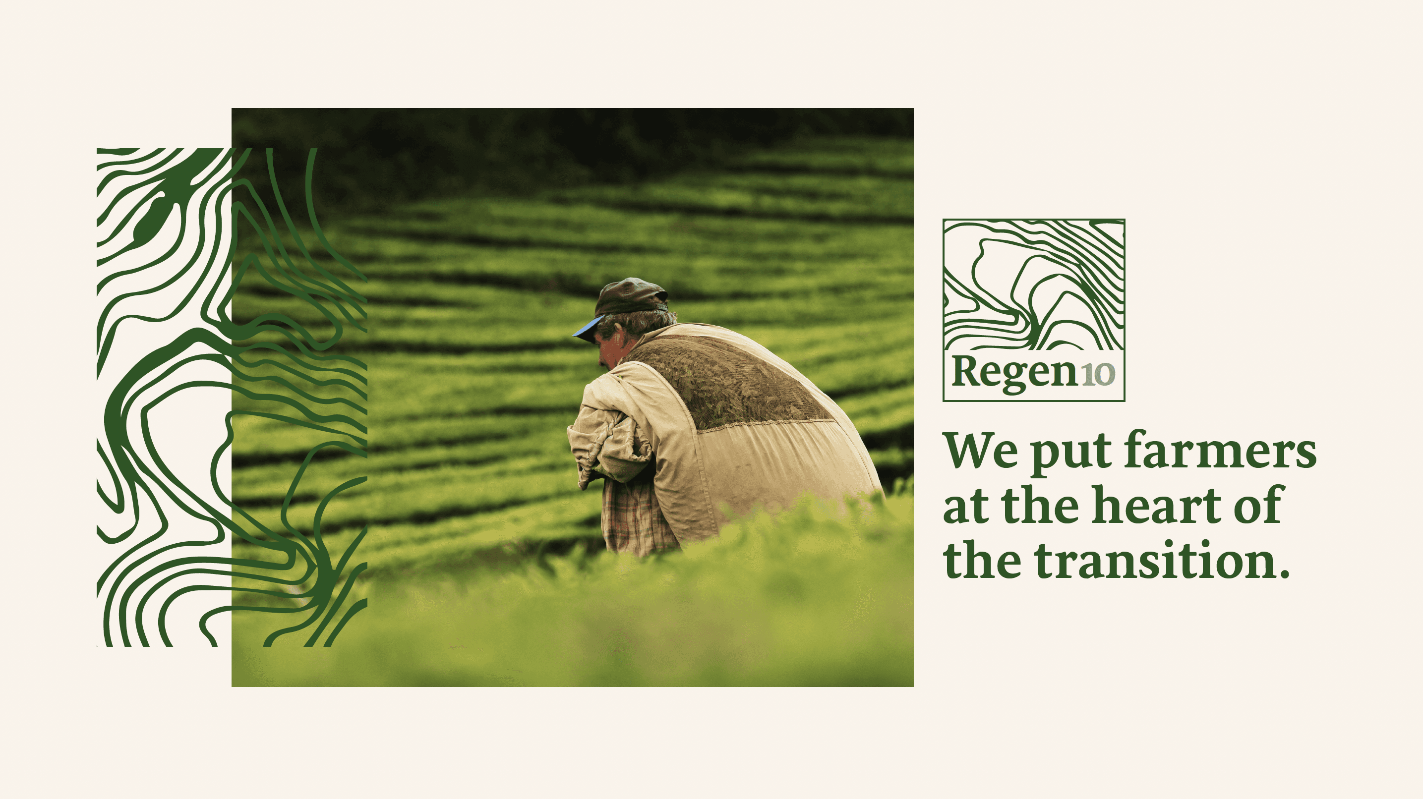
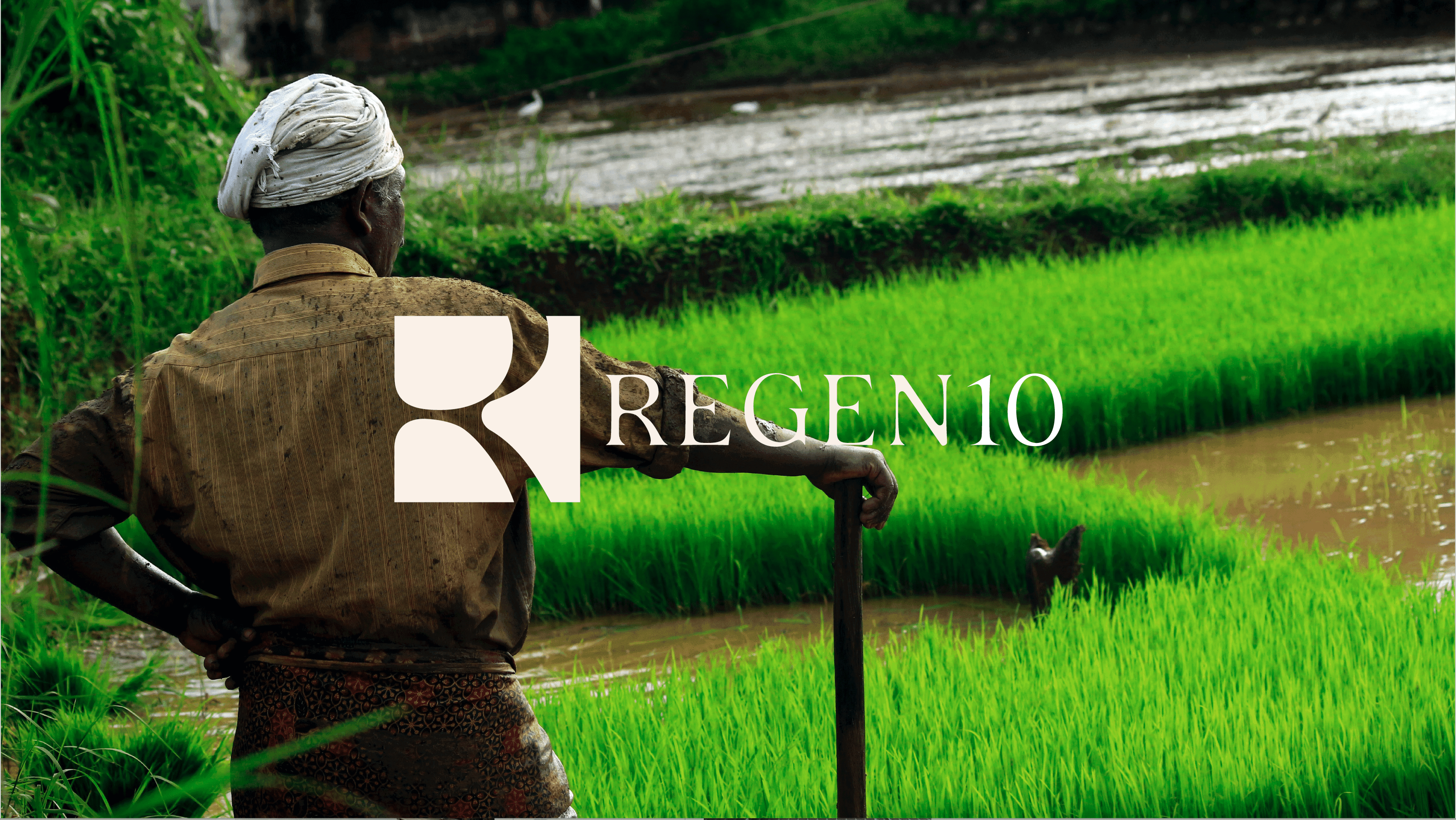
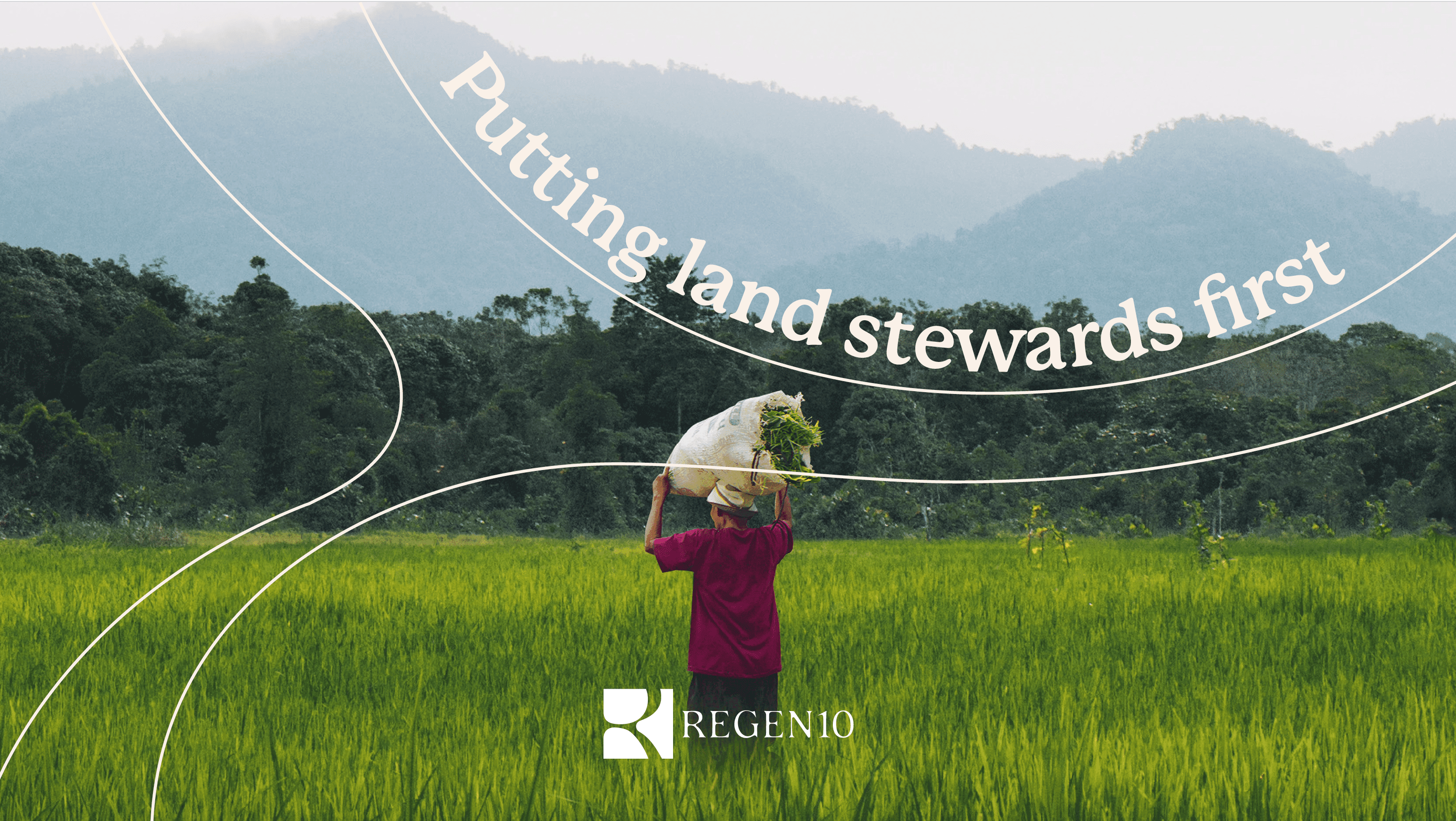
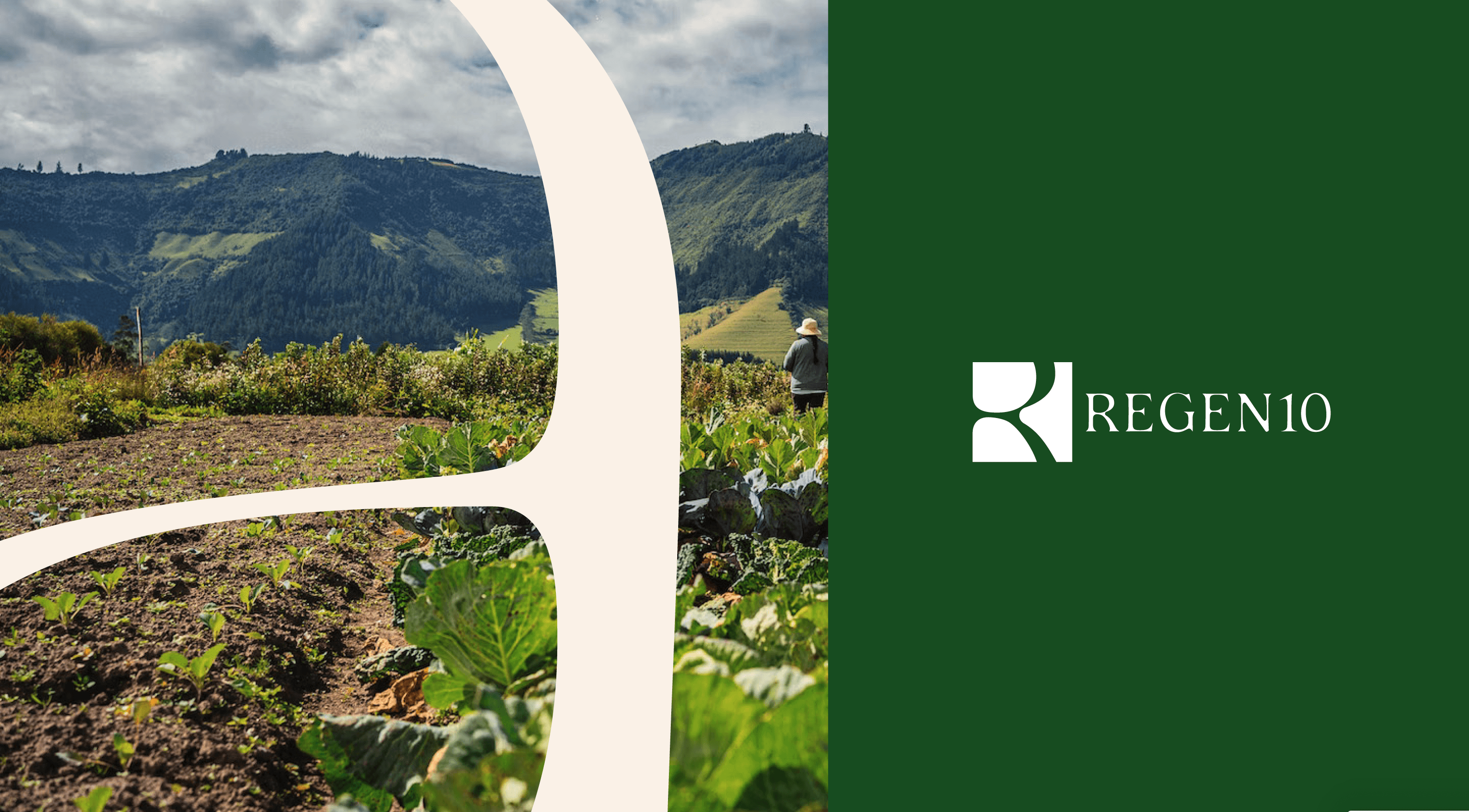
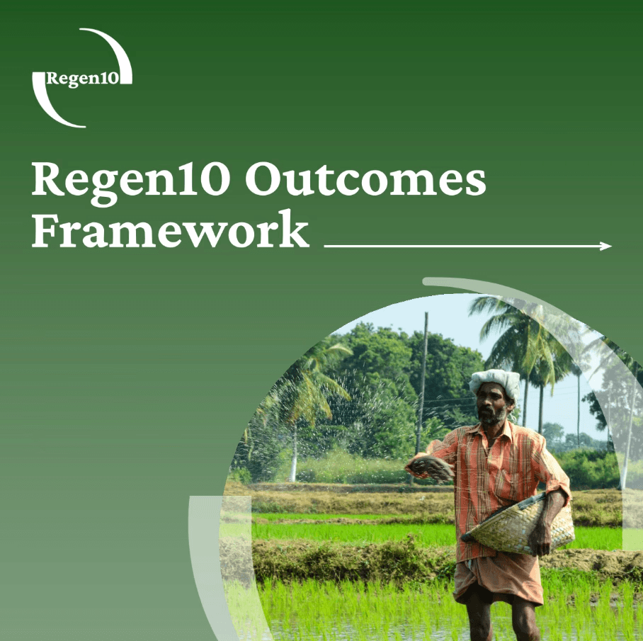
The client's chosen was Circularity, which was delivered along with brand guidelines, image bank and templates.

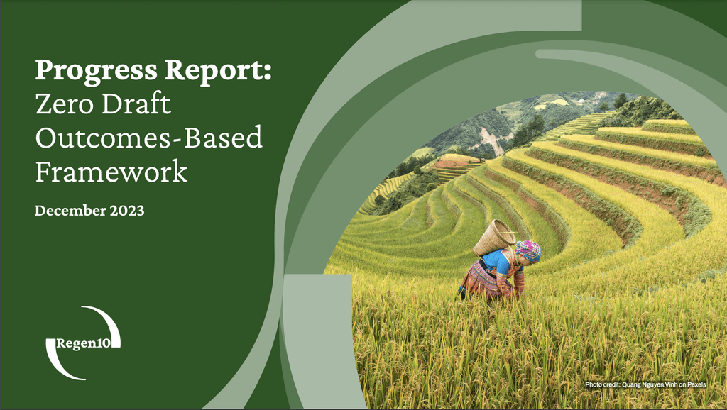
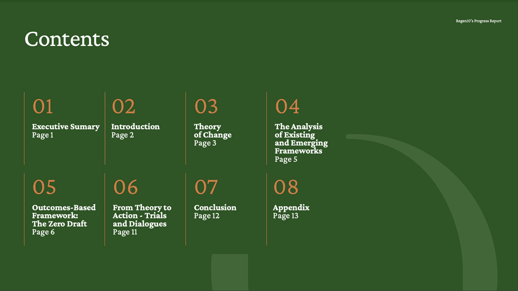
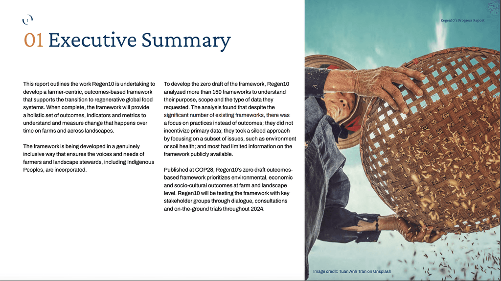
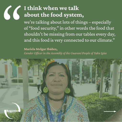
The brand has now been rolled out to their digital channels and project workstreams, with the many stakeholders pleased with the end result. I continue to work for them on their digital outputs, design reports and carry out video editing, below are some recent highlights of the brand system in action.


My personal favourite route was Mosaic, due to it's elegance, organic feel and potential for motion design.
LILY DRABBLE

2024

LILY DRABBLE

2024